

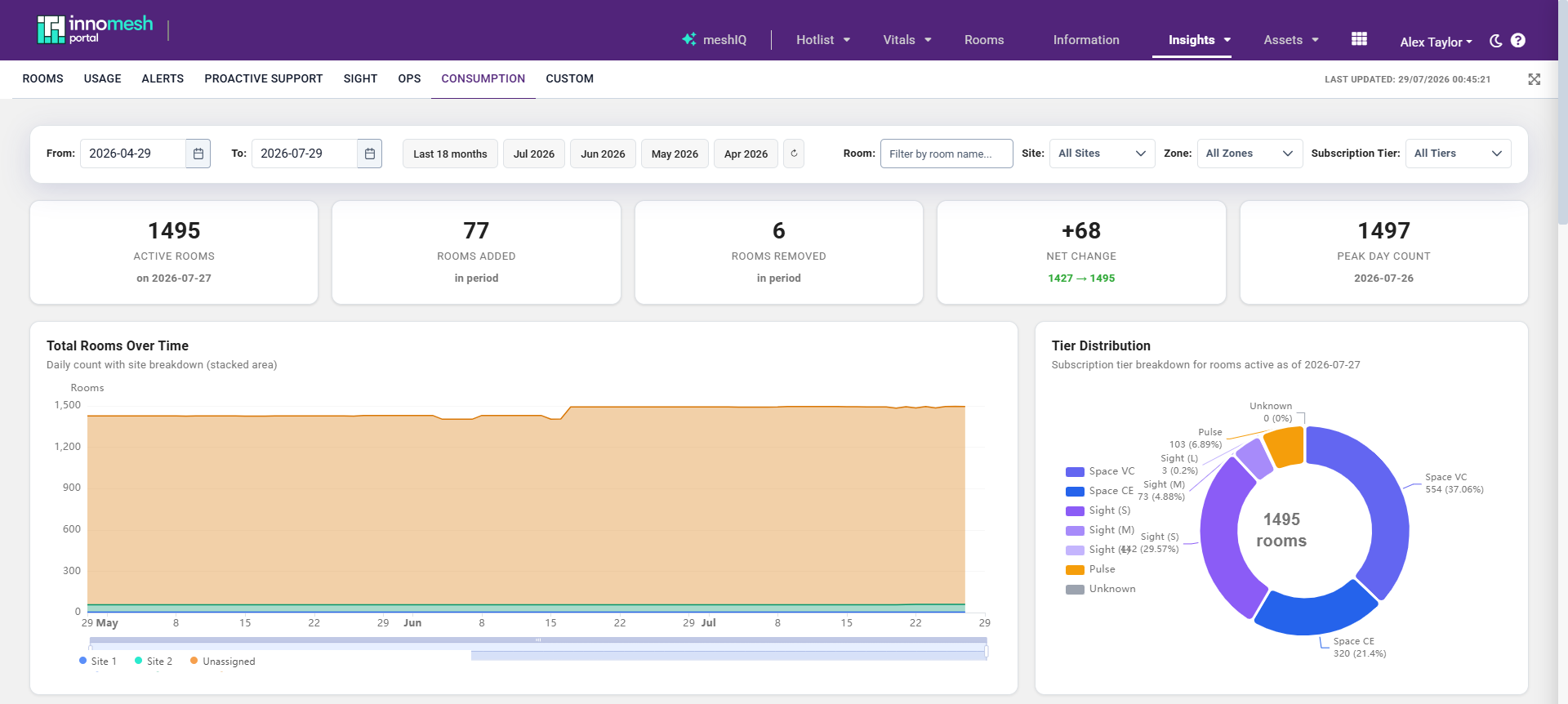
The Consumption dashboard tracks how many rooms are deployed against each subscription tier over time, so you can monitor consumption against your subscription and prepare for contractual true-ups. Open it from the Consumption tab of the Insights page.
Subscription Tiers
The dashboard reports rooms across six subscription tiers. Sight is split into three sub-tiers by the number of devices in the room.
| Tier | Description |
|---|---|
| Space VC | Space VC rooms. |
| Space CE | Space CE rooms. |
| Sight (S) | Sight rooms with 1 to 3 devices. |
| Sight (M) | Sight rooms with 4 to 7 devices. |
| Sight (L) | Sight rooms with 8 or more devices. |
| Pulse | Pulse rooms. |
Sites and Zones
Rooms are grouped two ways, and every chart and table can be segregated by either:
- Site is a logical grouping, typically a campus, department or regional office. A single tenancy can serve multiple sites, so site segregation lets you report consumption for each one separately.
- Zone is the high-availability server cluster that runs a set of rooms.
Every room is assigned a zone, but a site is optional. Rooms without an assigned site appear under Unassigned.
The Filter Bar
The sticky filter bar at the top of the dashboard controls every visualisation below it:
- Date range with From and To pickers, plus quick presets (for example, Last 18 months and individual months). The maximum range is configurable per tenant, up to 18 months.
- Room search to filter to rooms whose name matches your text.
- Site, Zone, and Subscription Tier dropdowns to narrow the view to a single site, zone, or tier.

The dashboard is not live-refreshing. It loads data when you open the page and when you change the date range or a filter.
KPI Tiles
A row of tiles summarises the selected period at a glance:
- Active Rooms on the most recent day in range.
- Rooms Added and Rooms Removed during the period.
- Net Change across the period, showing the start and end counts.
- Peak Day Count, the highest active-room count on any single day, with its date.

Visualisations
The dashboard renders 13 visualisations, listed below. Charts can be maximised to full screen, and the underlying data behind any visualisation can be opened in the inspect drawer and exported to CSV.
| Visualisation | Type | What it shows |
|---|---|---|
| Total Rooms Over Time | Stacked area chart | Daily room count, stacked by site, with a zoom control along the timeline. |
| Tier Distribution | Donut chart | Room count and percentage for each subscription tier. |
| Site Breakdown by Month | Stacked bar chart | Monthly room counts stacked by site. |
| Rooms by Site & Tier | Grouped bar chart | Tier breakdown within each site. |
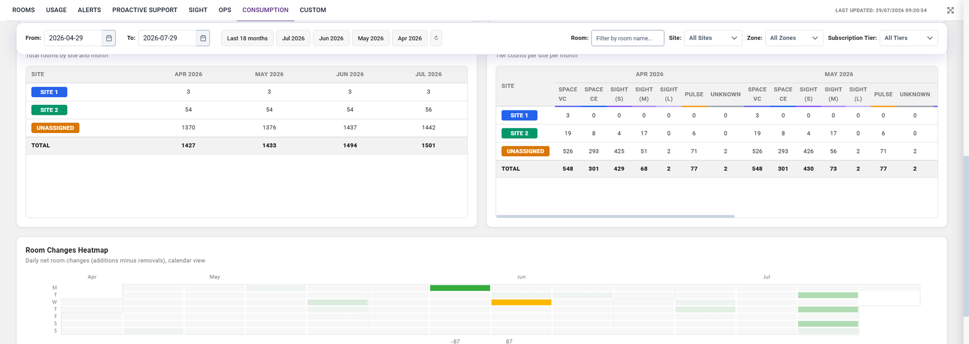
| Room Breakdown by Site and Month | Summary table | Sites against months, with totals. |
| Tier Breakdown by Site & Month | Table | Sites against months and tiers, with colour-coded tier headers. |
| Room Changes Heatmap | Calendar heatmap | Daily net room changes (additions in green, removals in red). |
| Room Lifespan Timeline | Gantt chart | Each room’s active date range, coloured by tier. |
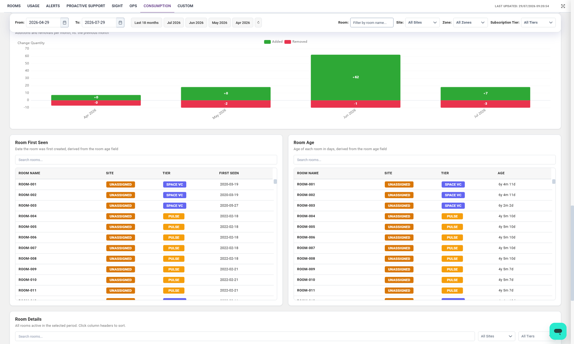
| Month-over-Month Changes | Waterfall chart | Additions and removals between consecutive months. |
| Room First Seen | Sorted table | Rooms ordered by the date they first appeared. |
| Room Age | Sorted table | Rooms ordered by age, in a friendly format such as “2y 3m 1d”. |
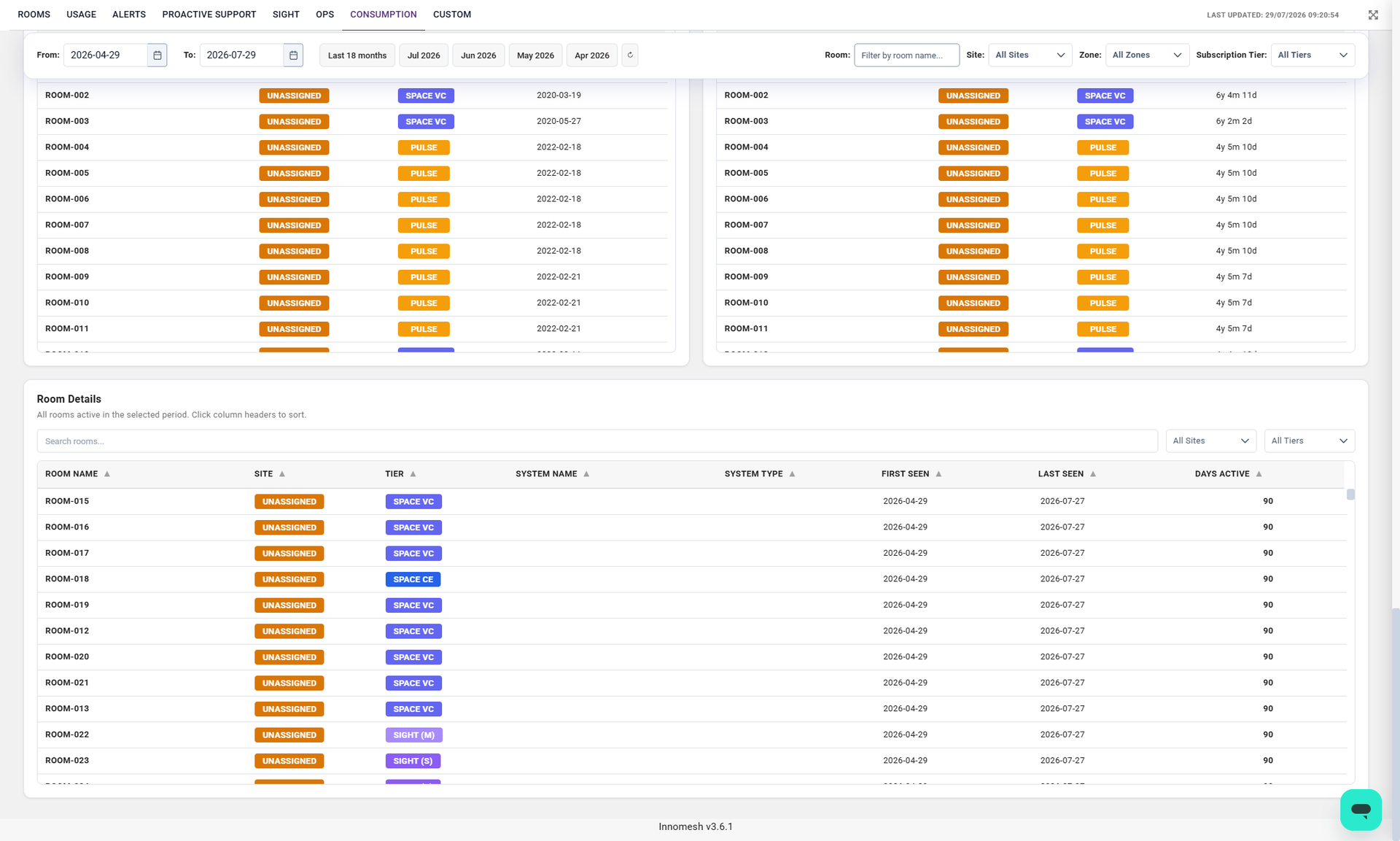
| Room Details | Sortable table | Full room data with search, site and tier filters, and column sorting. |
| Data Inspector | Sidebar drawer | The raw data behind any visualisation, exportable to CSV. |
Breakdown Tables and the Changes Heatmap
The Room Breakdown by Site and Month and Tier Breakdown by Site & Month tables give an exact monthly count per site, and the Room Changes Heatmap shows daily net room changes across the period.
Month-over-Month Changes, Room First Seen, and Room Age
The Month-over-Month Changes waterfall shows additions and removals per month, and the Room First Seen and Room Age tables order rooms by creation date and age.
Room Details
The Room Details table lists every room active in the selected period, one row per room, with its site, tier, first-seen and last-seen dates, and days active. Sort by any column by selecting its header, and narrow the list with the search box and the site and tier filters.
Exporting Data
Any visualisation’s underlying data can be exported. Open the inspect drawer on a chart to view its data as a table, then download it as a CSV. Tables such as Room Details can be filtered and sorted before you export, so you export exactly the view you need.
Interactive Features
- Chart maximise opens any chart in a full-screen overlay.
- Inspect drawer shows the data behind a chart and exports it to CSV.
- Dark and light theme toggle, which persists your preference.
- Responsive layout that adapts to tablet and mobile widths.